The story
River Blooms is a premium floristry brand that treats flowers as a gifting ritual, not a commodity. It needed a brand world that communicates that finesse at first glance: on the shelf, on the box and on the phone screen.
We built the brand in two layers: on paper, the logo, labels and business cards; on screen, a social language that makes the bouquets the star of the stage.
The identity
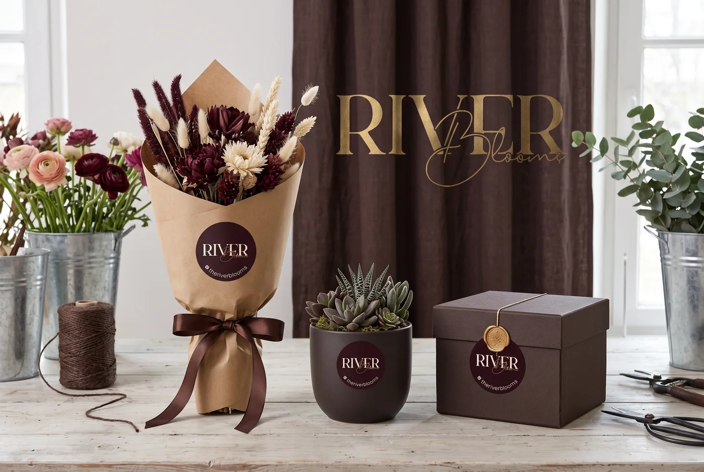
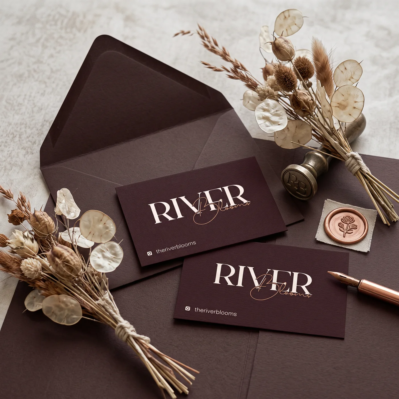
The logo pairs a serif “RIVER” with a handwritten “Blooms”, capturing the brand’s stance between classic and warm. A palette of burgundy, kraft and gold spreads across the whole packaging world, from labels to wax-sealed envelopes.
The identity was delivered to work with equal grace in print and on screen, including an animated version of the logo.
Social media
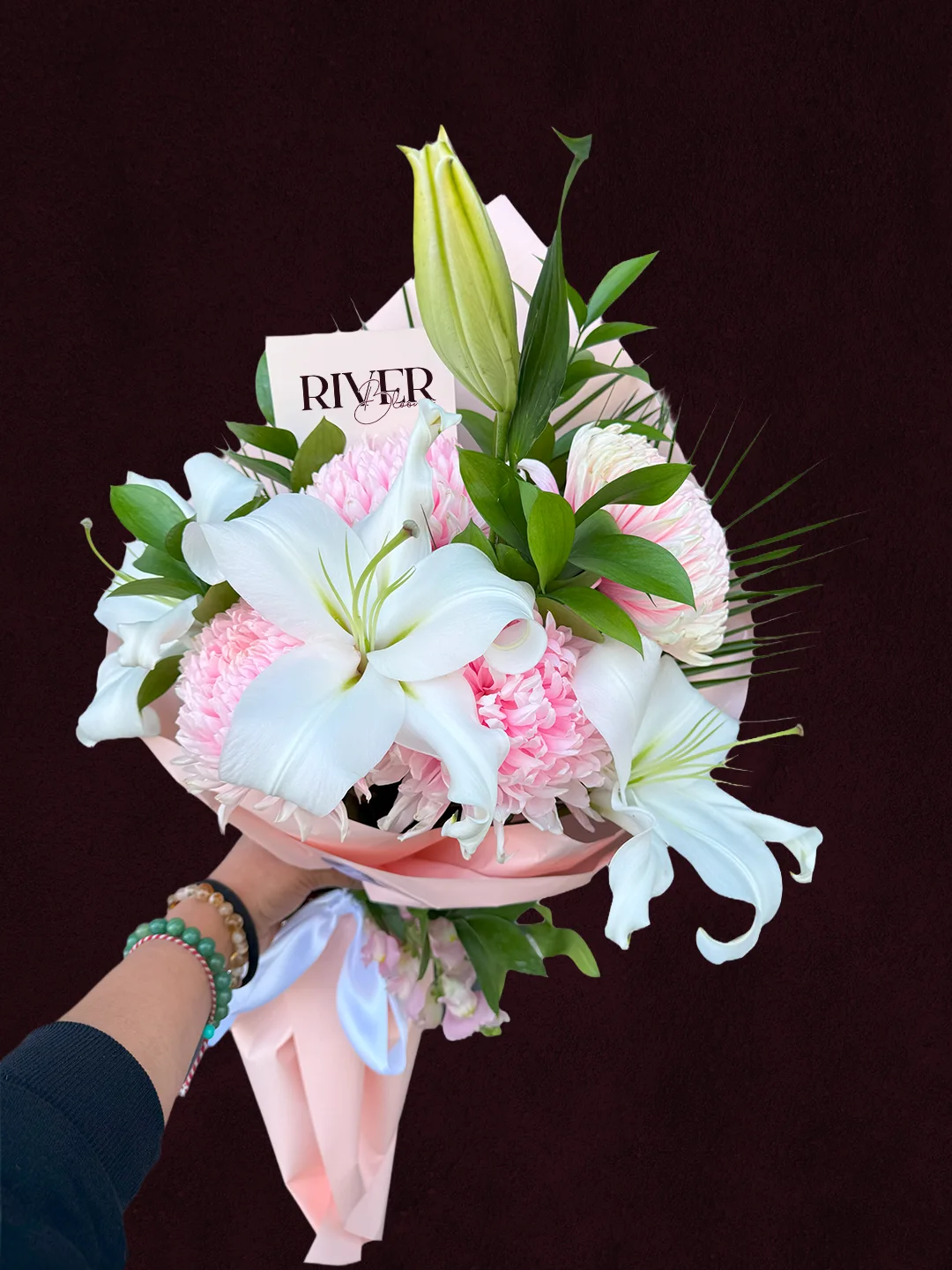
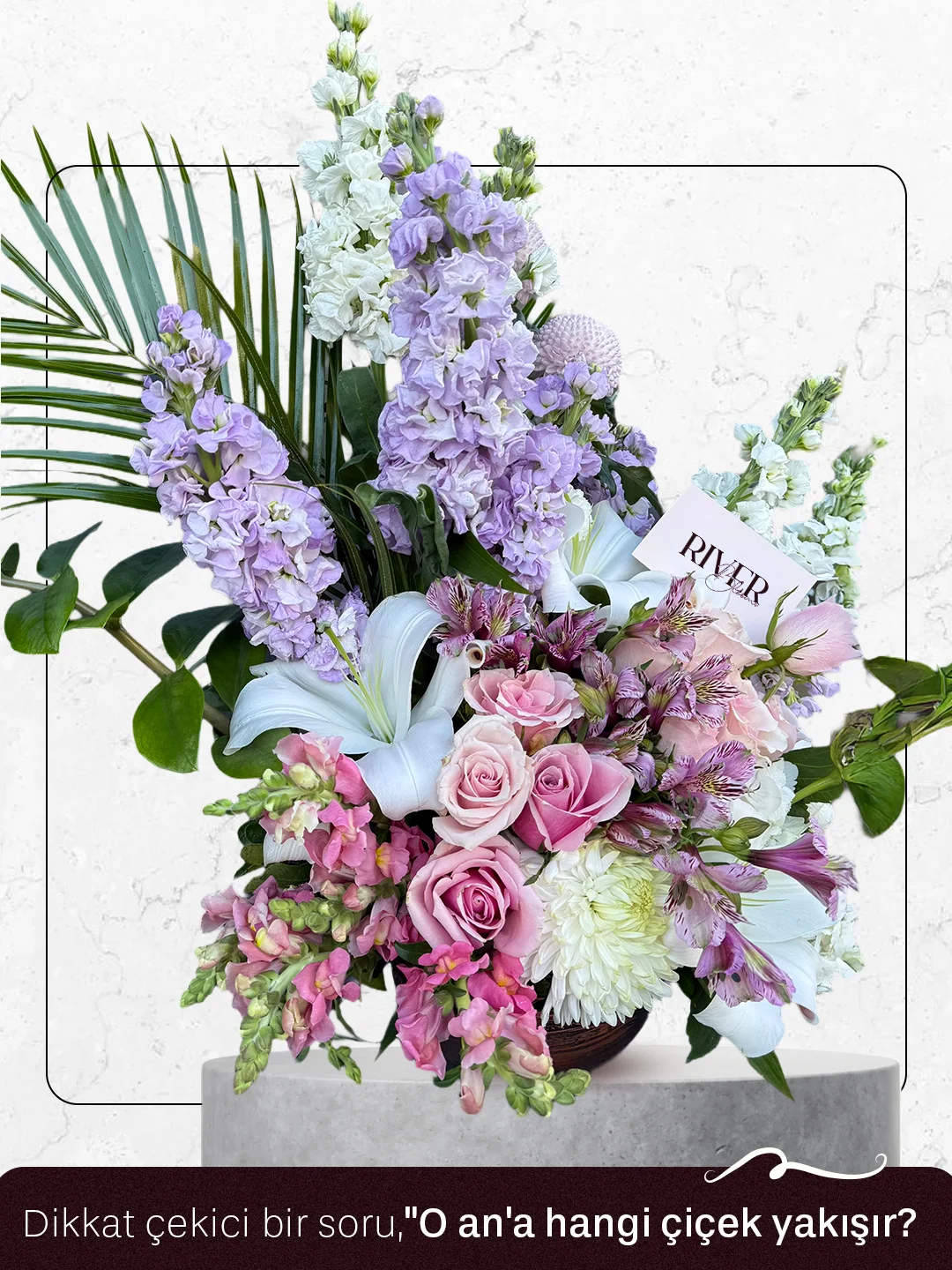
The feed is carried by the bouquets themselves: marble surfaces, natural light and arrangements proudly wearing the brand’s tag. Every frame presents the product like a boutique window, not an e-commerce card.
- 56 gönderi
- 9338 takipçi
- ··· takip
River Blooms
premium floristry · identity & social media
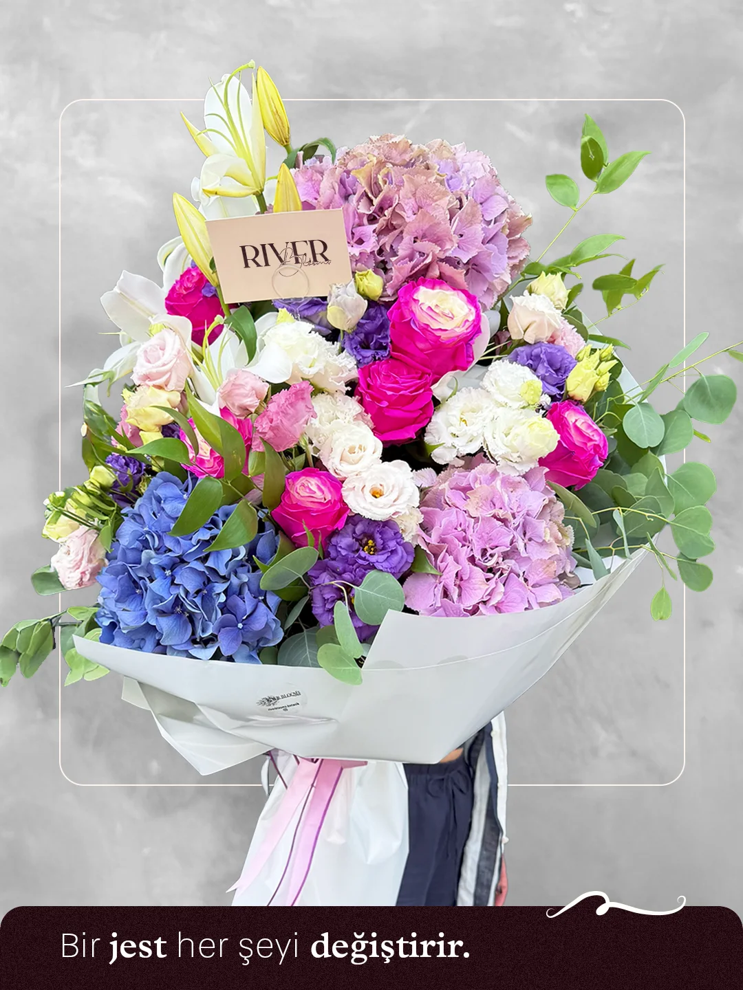
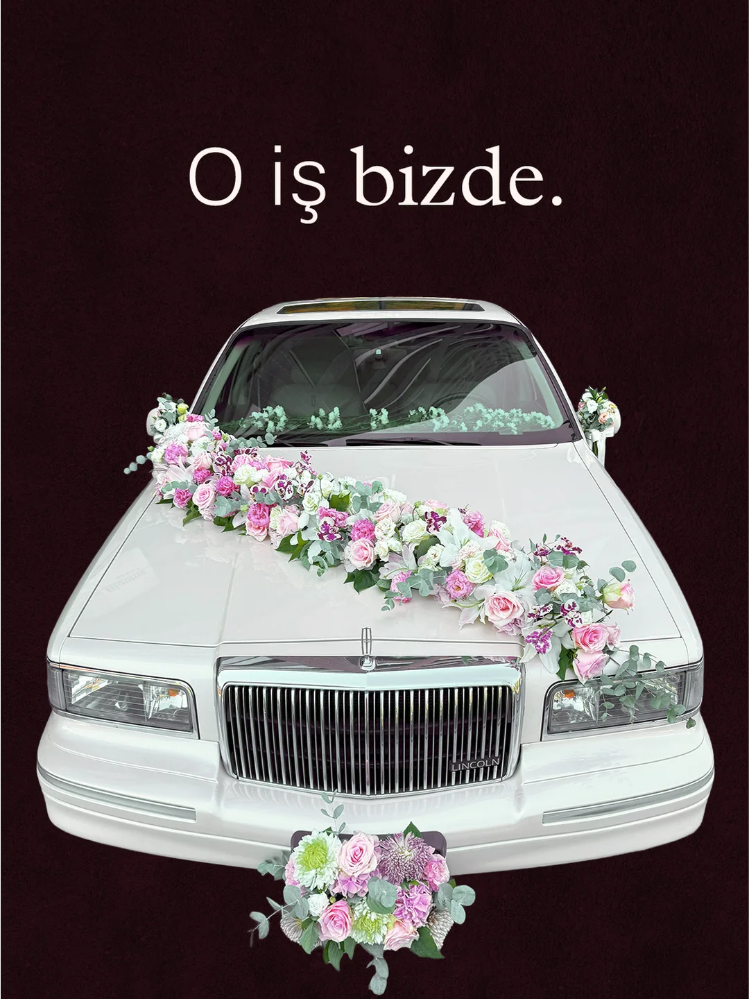
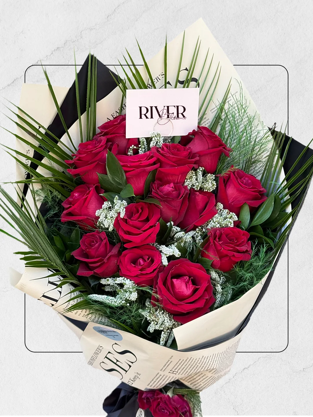
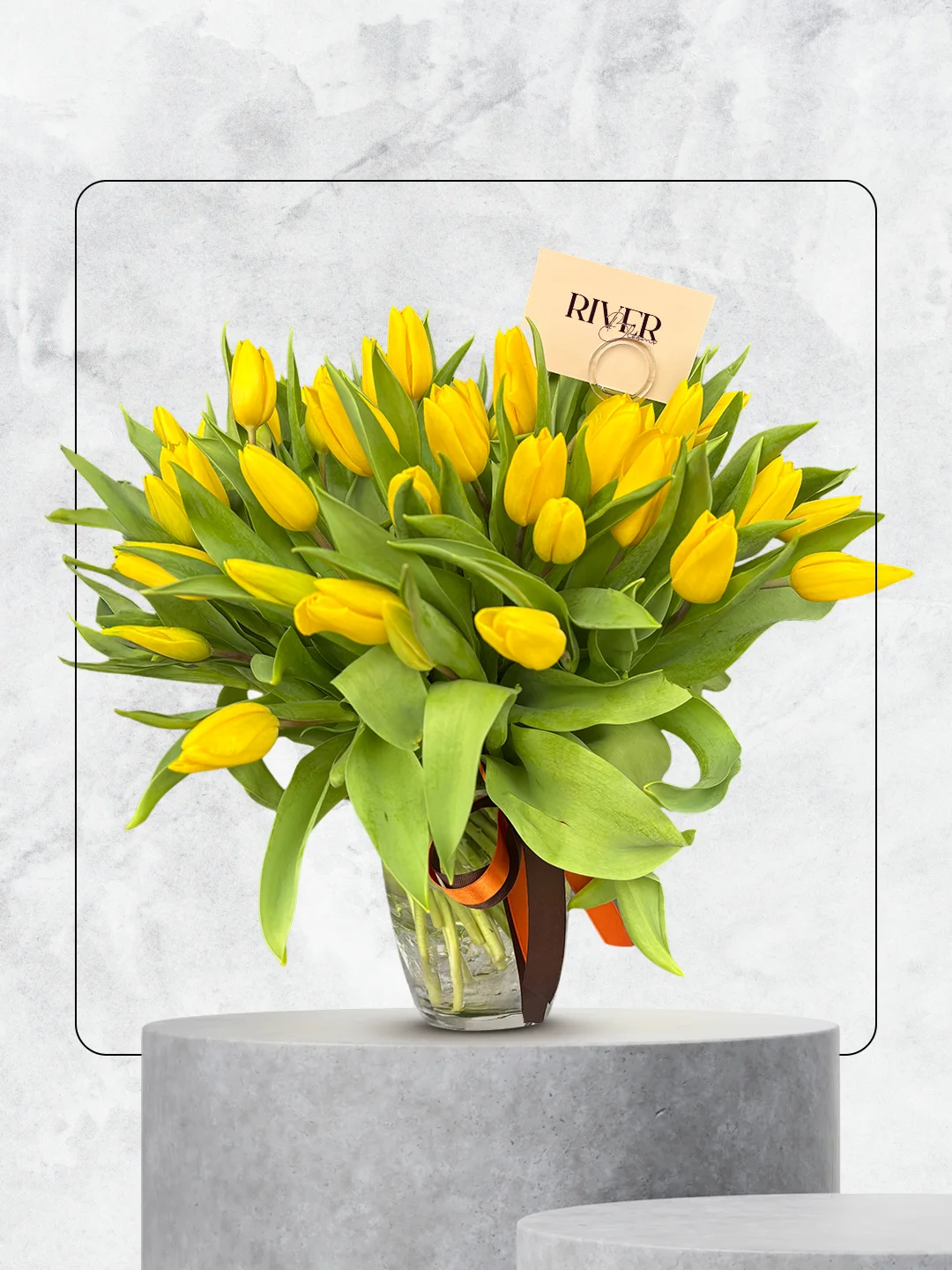
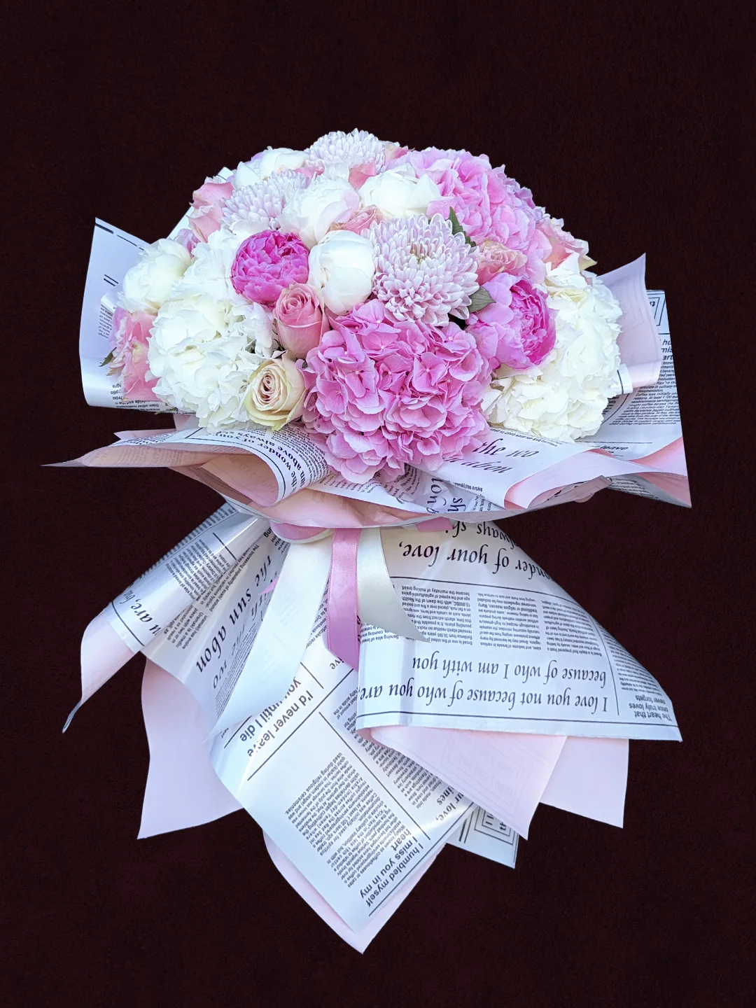
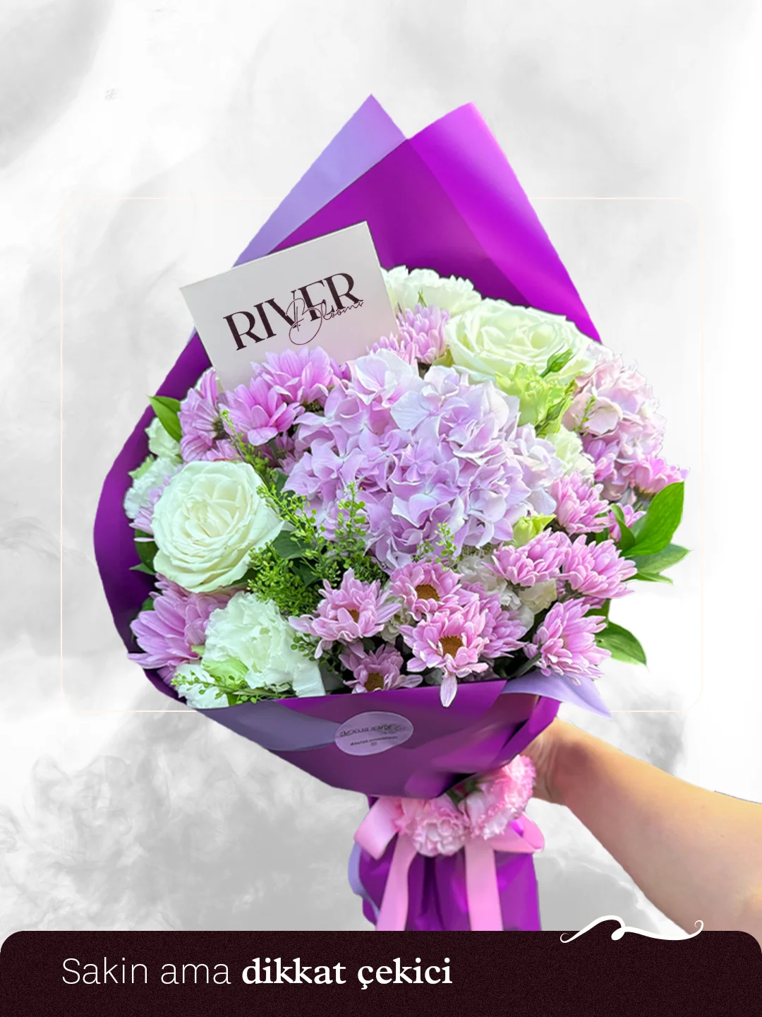
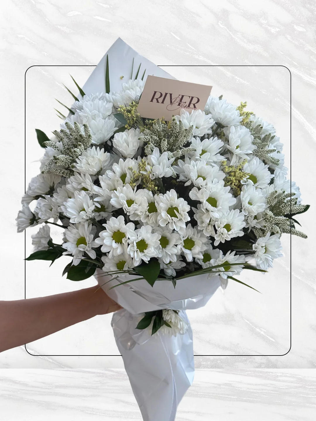
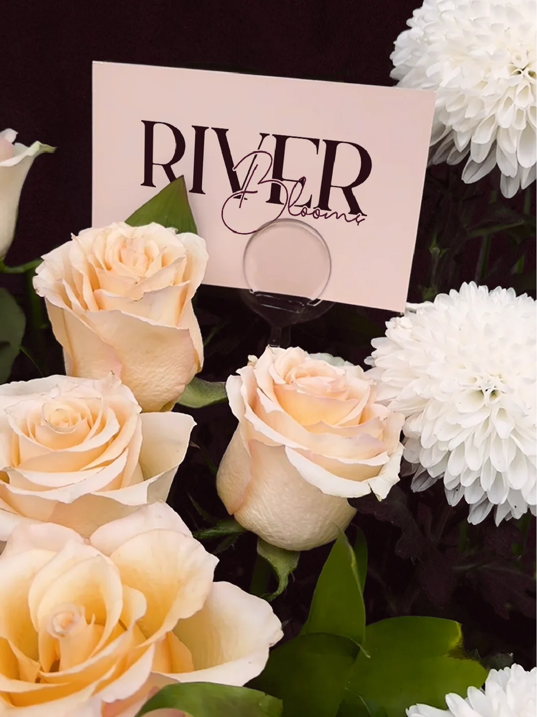
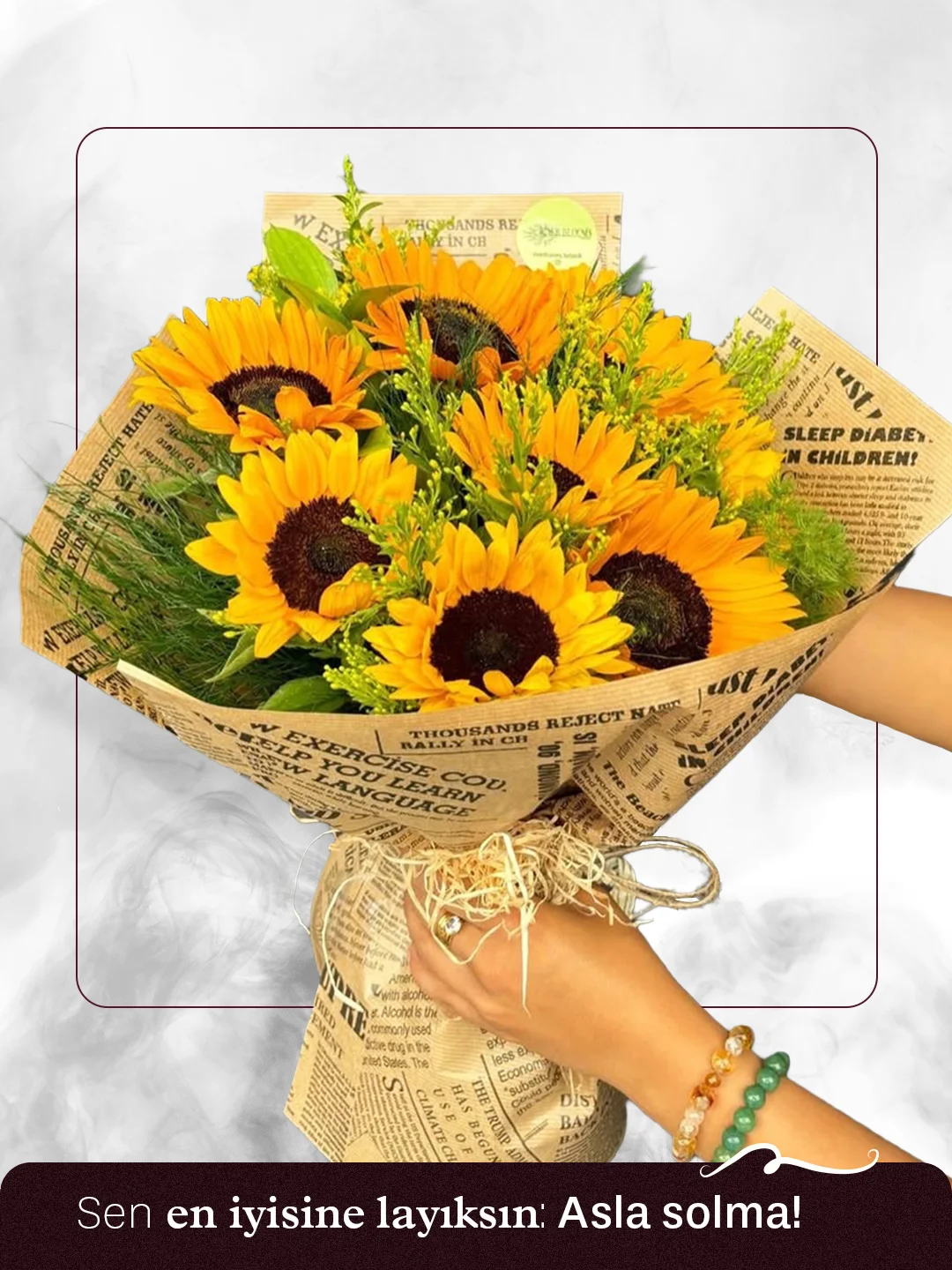
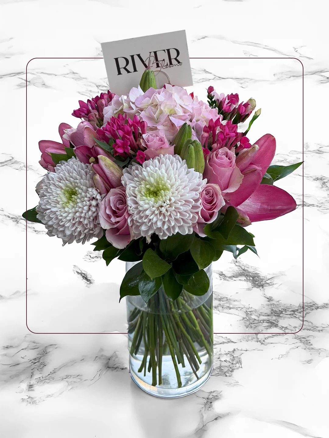
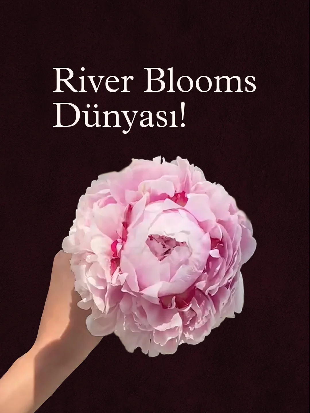
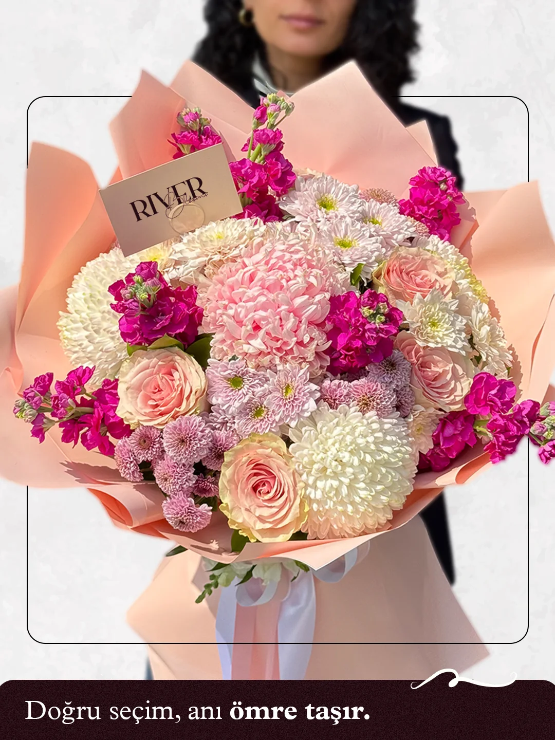
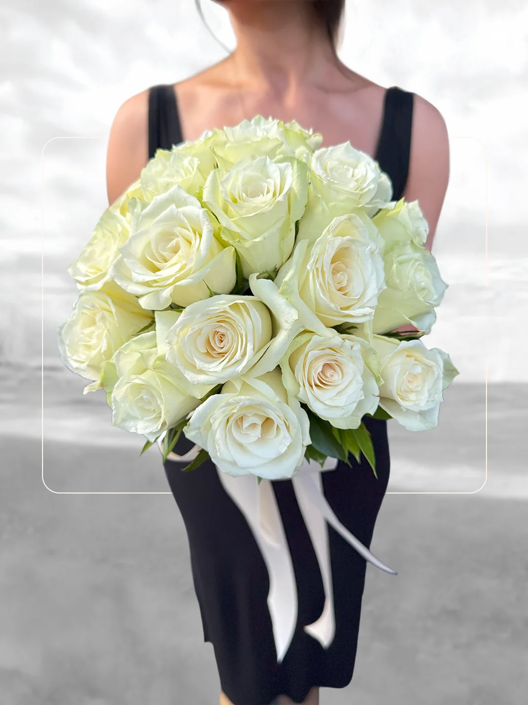
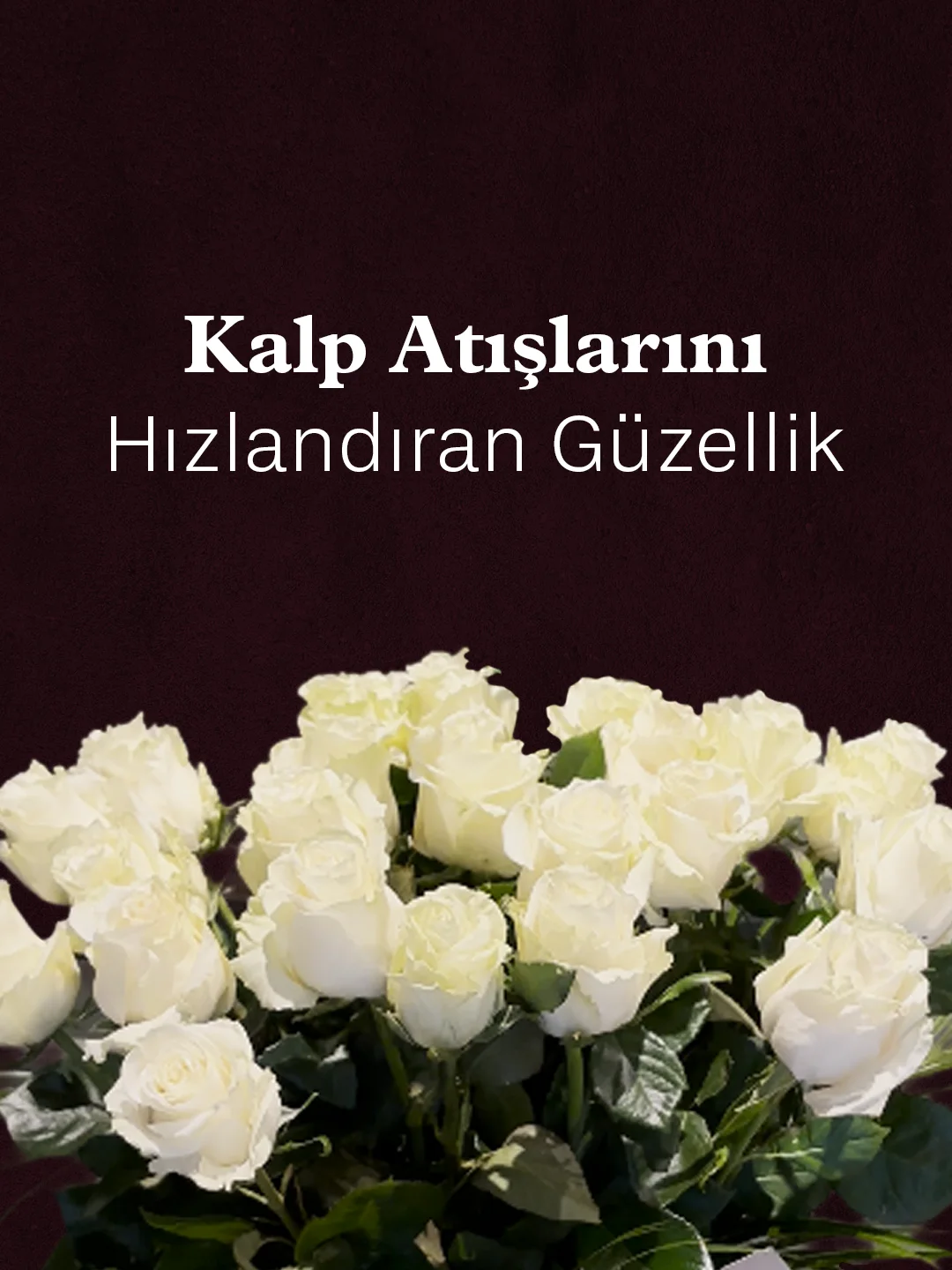
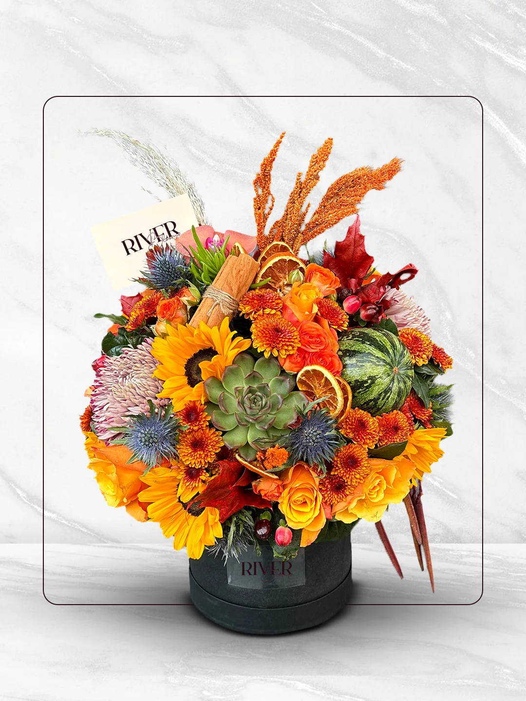
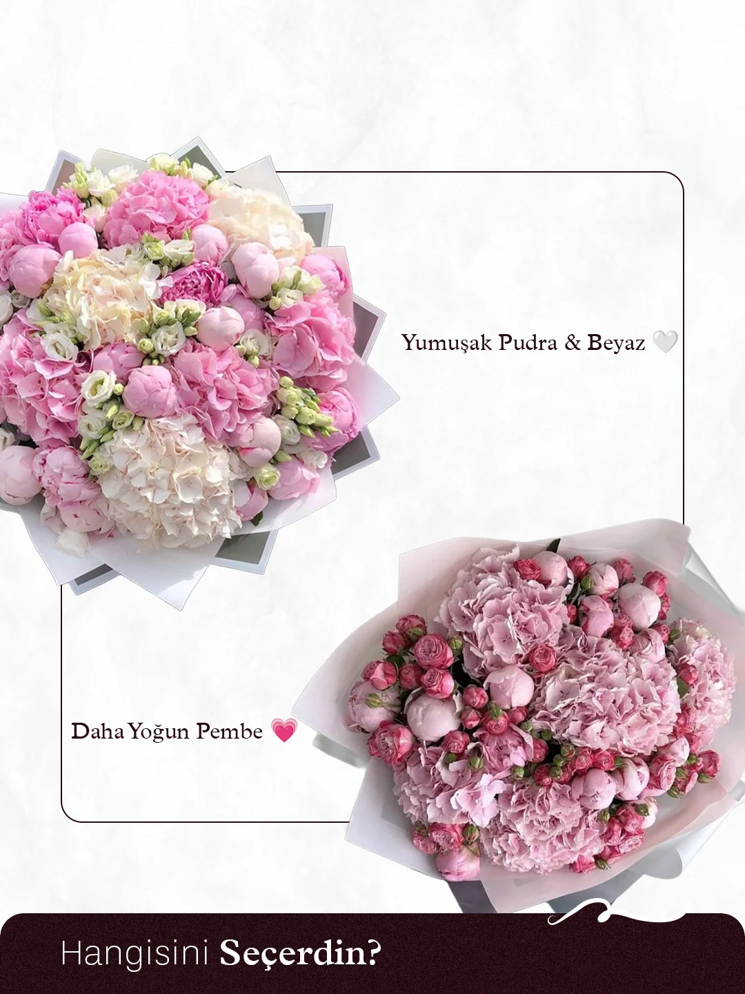
Reels
Short videos that carry the brand’s rhythm from preparation to delivery: the bouquet coming together, the ribbon being tied, the box opening at the door. Produced end to end in-house.
Stories
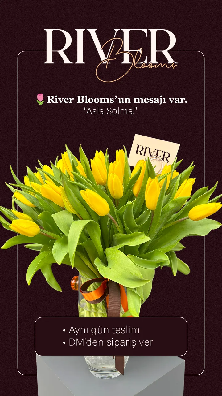
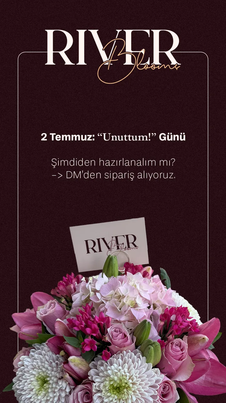
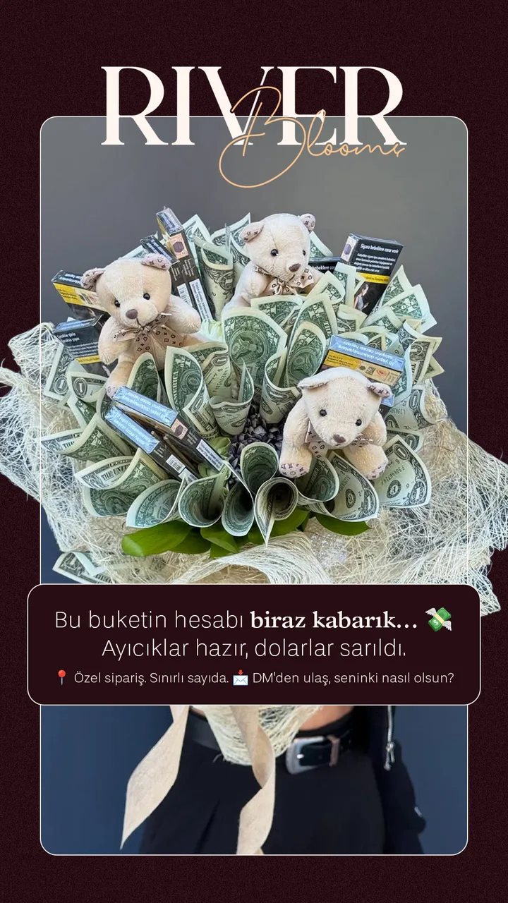
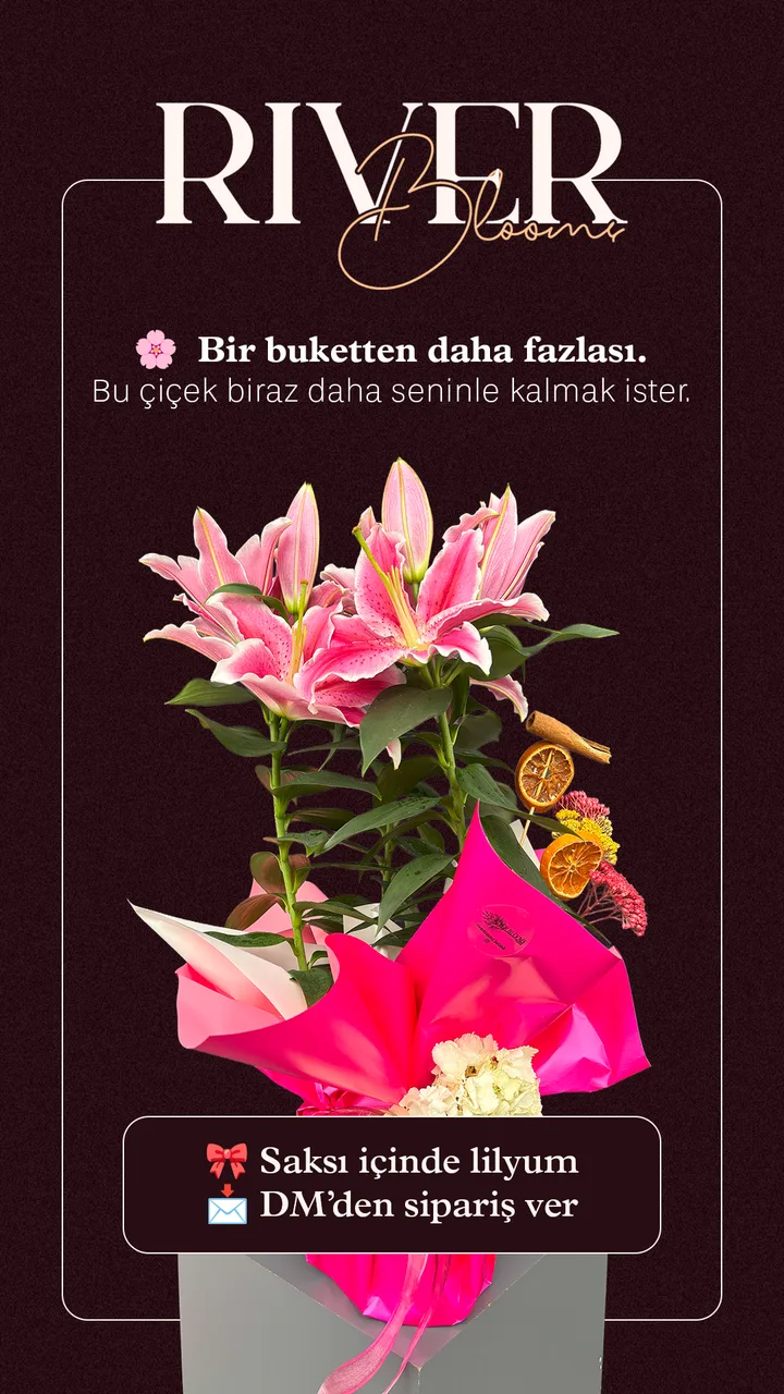
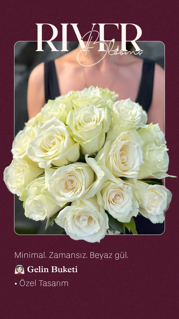
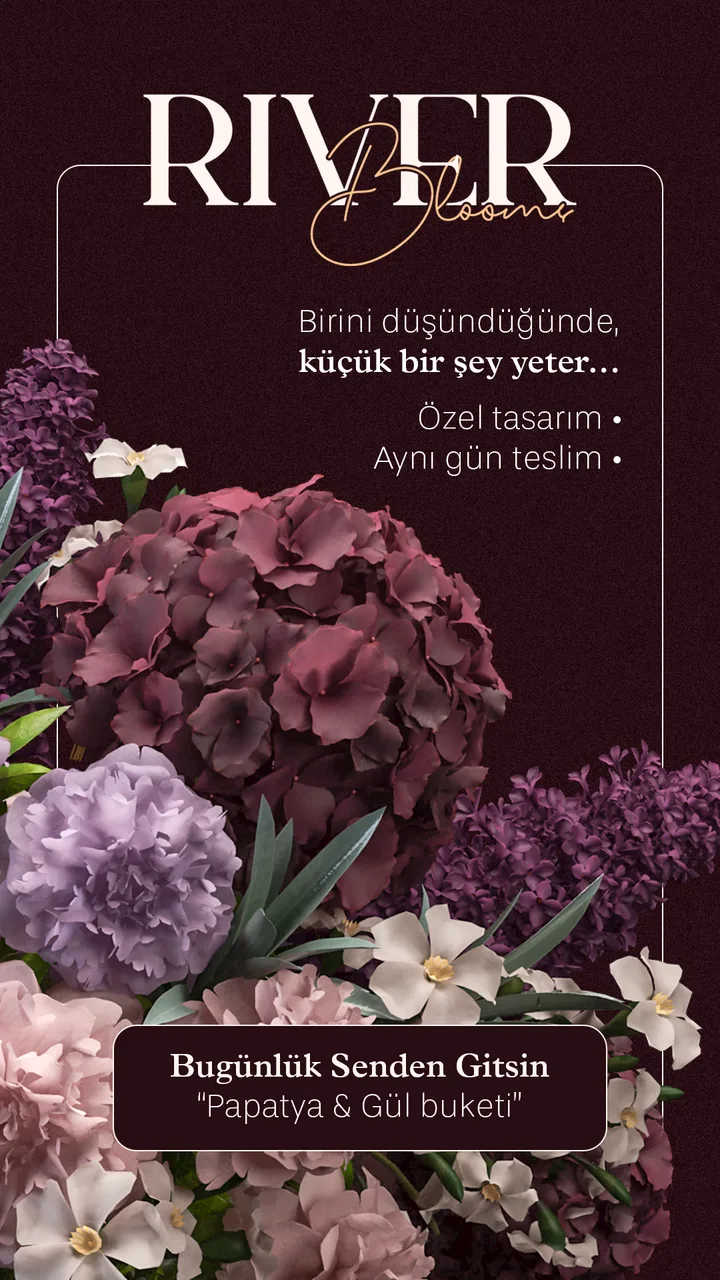
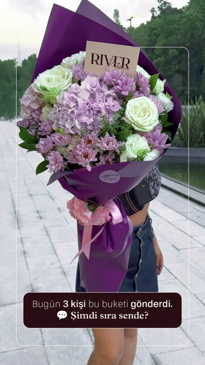
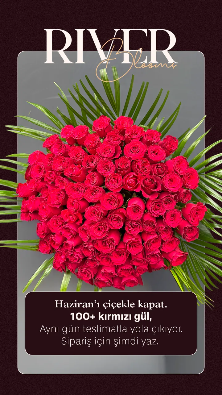
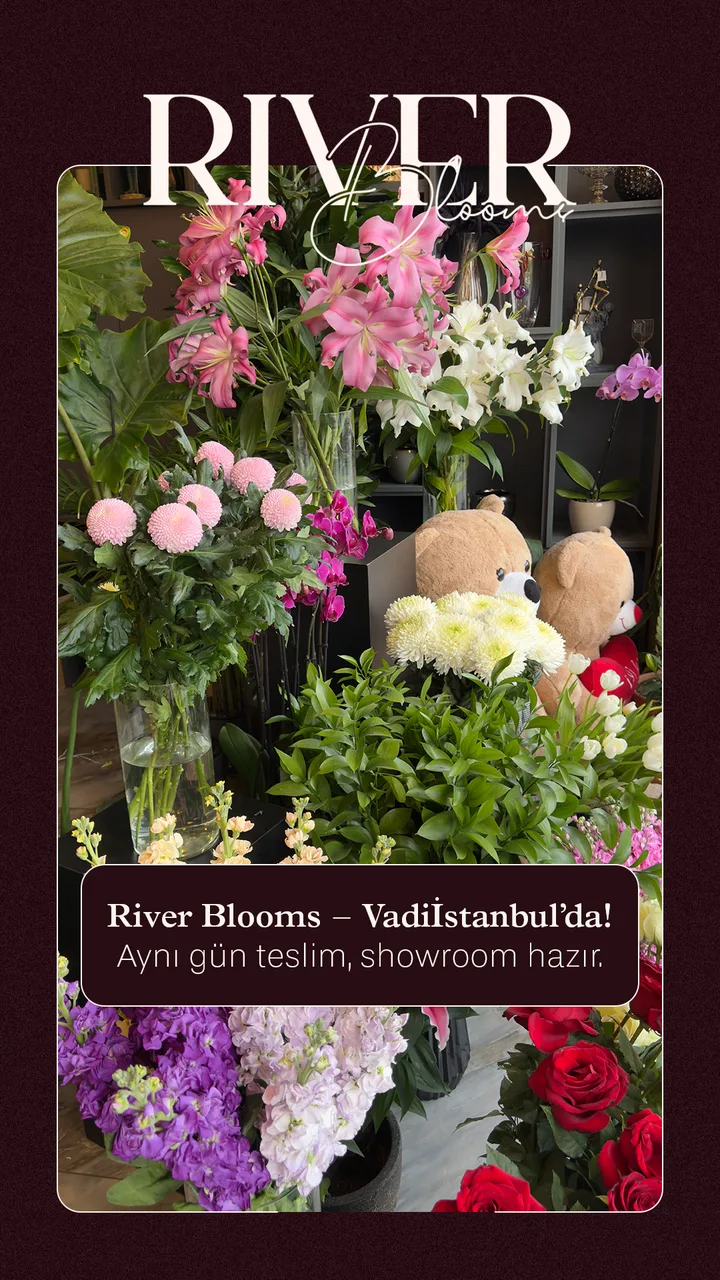
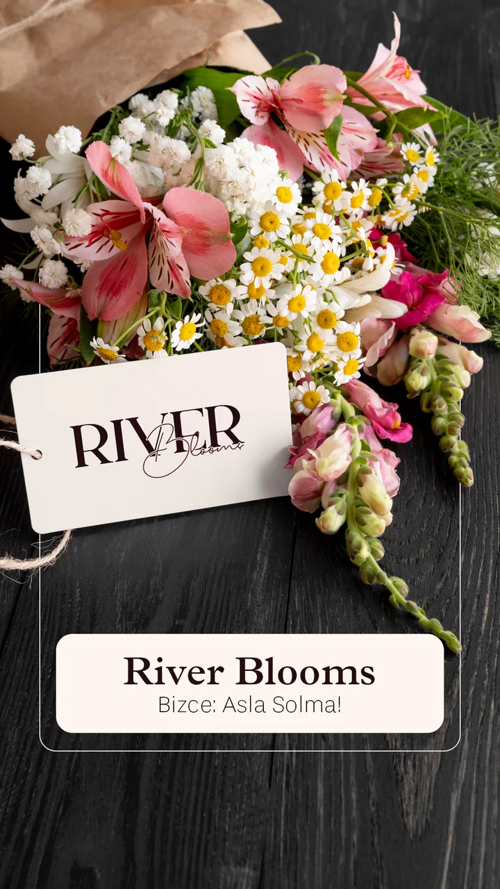
Story designs are the brand’s daily voice: campaign announcements, reminders and seasonal edits, all in the same burgundy-cream elegance.
more work



Shall we grow your brand with grace?
Identity, packaging and social media, built in one coherent language.